SELF an end to end SaaS mobile app.
Book, manage, and keep track of all self care visits and notes within one app.
User research, Brand Identity, UX/UI Design, Prototyping, Usability Testing
Background.
SELF app is a SaaS (software as a service model), also known as "on-demand software". Some of most notable examples are: Boosky, Airbnb, Shopify, Eventbrite, ect. SELF helps clients to save time and stay organized, while helping local businesses grow big, strive, and build clientele.
Problem.
Did you ever try to remember what treatment exactly you got during your last visit to the spa? Or maybe you forgot the name of the stylist who happened to do your hair at the new salon last time, or cannot find any photos of that beautiful hairstyle you got done couple months ago? Or you moved and are trying to explain to the new stylist what was the color and the name of the product used to achieve the best result , but you only wish you had that info saved. That’s a very common issue. Life gets busy, data gets erased, contacts get lost, ect. This kind of information does not seem that important to properly write it down every time, at least to most of us, however turns out to be very important during those times we actually need access to it. With that being said, idea to create SELF was born.
Solution.
An end-to-end mobile app that allows the users to book, manage and keep track of all self care visits as well as all important visit details within just one app.
Scope.
SELF’s target user base is primarily millennials based in Northern America, who enjoy self care and are looking for ways to keep their visits organized for them.
Constrains.
It is crucial to find a balance between app feeling friendly and cozy while also building the trust via UX.
Timeline.
80 hours (4 weeks).
My Role.
SELF SaaS app was an end-to end conceptual project that I worked on as a solo designer. My areas of responsibility were: User research, Brand Identity, UX/UI Design, Prototyping, Usability Testing.
Tools.
Figma, Google Slides, Google Docs, Surveysparrow, Maze


How might we make self-care experience fun and effortless while helping the user feel organized and on point of their well being?
Design thinking methodology helped me stay focused on proper deliverables for this project:
01. Empathize
Research user’s needs and study the issue in and out:
Secondary research
Competitor analysis
User interviews
02. Define
Define user’s needs and problems through:
Project goals
Problem statement
User personas
User flow
Feature roadmap
03. Ideate
Questions, assumptions and ideas:
Brainstorm ideas
Sketch lo fi
Brand identity
04. Design
Creating effective solutions through prototypes:
Digital mid fi wireframes
UI
Prototyping
05. Test
Testing solutions and iterating based on feedback:
Usability testing
Empathy map
Priority revision matrix
Iterations
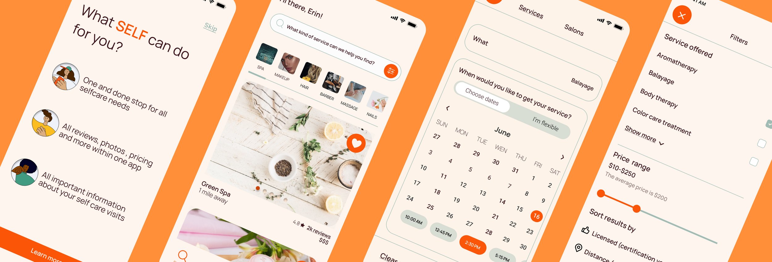
Users may get the app from the Apple store, or via the invite link shared by the salon. Then the user is welcomed with the splash screen that is followed by an easy and minimalistic, but pretty informative onboarding process. Here the user is being introduced to SELF app features that can help elevate and improve the experience of booking and managing self-care needs in an efficient way.
🔍 Explore: Search by WHAT, WHEN, WHERE; sort and filter as you wish
❤️ Wishlist: create your lists of places to save
📒 Visits: see past and upcoming visits, add notes and photos from all your visits, and never lose info again
📩 Inbox: here are all of your notifications from SELF and messages from friends
🧑🏼 Profile: manage your user profile; list your own salon here
How it works?
Think Airbnb for self care.

01. Empathize
Research user’s needs and study the issue in and out.
According to Competitor analysis results, currently there are various beauty apps available as Urban (for at-home beauty and wellness treatments), Booksy (top scheduling app for busy beauty pros), Styleseat (online destination for beauty pros and clients in USA), Treatwell (for finding salon appointments), LeSalon (for nails on demand), Beyou (for makeup appointments), Blow LTD (for speedy beauty), Glamsquad (on-demand makeup, hair, nails), Ruuby (for special occasion glam), Gloss Genius (platform for salons), Fresha (all-in-one platform for salons), just to name a few.
The market is very dense. However, when it comes to the SaaS platform that empathizes the “Notes” feature, there definitely is a great business opportunity for this type of app in North America.
I have used Survey Sparrow software to conduct a User survey with 17 participants total in oder to get insights on how users feel about their current methods of booking appointments:
Users prefer the UI to be as simple and clean as possible. Some natural tones are welcomed, but overall they prefer not to feel distracted by the visual part of things to better focus on the tasks they want to get done.
Vast majority of the users would appreciate the ability to book all self care appointments via one app.
83%
prefer to book via app or website for convenience
53%
are happy with the way appointments are booked
88%
would like to have the ability to book within one app
02. Define
Define user’s needs and problems.
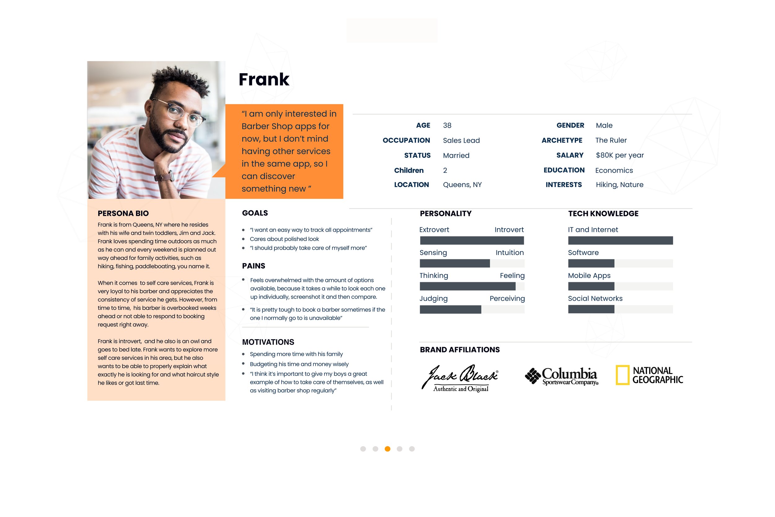
Let’s look closer into demographics. Who are we designing for exactly? SELF’s target audience is primarily millennials with an annual salary up to $100k per year, who want to save time and keep organized.
Based on research findings and user survey results, I have worked on developing two main User flows:
client-facing flow, and
salon-facing flow.
I received a lot of information and insights from my user survey, so I decided to organize my findings via Affinity Map to make it easier to keep track of all important info and to define what is an absolute must for the app.


03. Ideate
Questions, assumptions and ideas.
Ideation step is the time to explore viable solutions. I focused on sketching the screen layouts for the future SELF app and working on logotype, later on discussing my ideas with other designers during design critique sessions.
Sketching ideas and Brand Identity
Before jumping into hi fi wireframing process, I love to take my notebook and sketch out some wires by hand. I look into the apps that already exist on the market and analyze what makes them successful, also circling back to my user survey into and consulting with my Affinity Map.
When creating the logo, I have considered the user research and was looking to create something minimalistic, unisex, non complex and tasteful. The name "Self" felt as a great choice with the meaning "a person's essential being that distinguishes them from others; your self is your basic personality or nature, especially considered in terms of what you are really like as a person" , taking into account that this Saas app will allow users to tailor the self care experience to their needs.


04. Design
Creating effective solutions through prototypes.
I wanted to push myself and explore. SELF UI went through 3 major iterations as I was looking for a good balance of texture, color, and visual hierarchy of elements.
Mid fi wireframes
After receiving initial feedback on my hand drawn sketches, I started working on digital wireframes and constantly iterated based on feedback from design crits.


05. Test
Testing solutions and iterating based on feedback.
Here are some of major iterations that UI went through based on mentor sessions, design crits, usability testing. It was a process of finding the balance between texture, pop of orange, shade of beige that is easy on the eyes. I was challenging myself to use colors while making sure I constantly get feedback on UI to make adjustments as I go.


Takeaways
What have I learned?
Creating an end-to-end mobile app was a great learning experience that taught me very important lessons about usability and empathy in the UX design process. The key aspects that I am taking out of this project are:
☝🏼 You are not your user. This seems so simple, however, the more users I interviewed, the more I realized how important it is to use all the means available to receive feedback from the user. Every single insight we are able to receive as designers are extremely important to get and analyze because we never know what exactly the users will see, feel, and think when they interact with the end product and how their prior experience shapes the perception of the app we put in front of them.
✌🏼 You cannot design for everyone. Focus on your target user base. Who are we designing for exactly? Making sure that this question is answered early on and the process takes the answer into account all the way, is the key that allows the designer to stay on track and make the decisions that will benefit the product long term. I felt stuck when the feedback was contradicting: some users wanted the UI to be more expensive looking and high-end, while other users loved the funky feel of it that made them feel cozy and at ease, and that self-care “is not just for the rich”. Turns out, when we think that we design for everyone, it might seem like a perfect solution at the initial stages of the design process, however when getting to the actual nitty-gritty of Ideation and especially the Usability Testing stage, the more specific we are in who is the user, the more confidence we can have when we are working through Design Decisions.
👌🏼 Research, research, research. Iterate, iterate, iterate. The design process is a journey of discovery.