
Adding a SWITCH feature to Instagram.
Manage your news feed easily and stay focused.
User research, UX/UI Design, Prototyping, Usability Testing
Background.
Instagram is a free photo and video-sharing app available on iPhone and Android with over a billion of active users. People can upload photos or videos to their service and share them with their followers or with a select group of friends. They can also view, comment, and like posts shared by their friends on Instagram. Anyone 13 and older can create an account by registering an email address and selecting a username.
Problem.
Currently, there is no easy and smooth process for users to be able to customize their news feed. During my primary research, I learned that many users were forced to create multiple Instagram accounts in order to better differentiate between the content that their feed is showing. That seems like a lot of unnecessary steps and extra work for the user when the issue could be easily fixed by allowing the users to create their own lists of accounts they want to see at a given moment and make their own collections of those accounts. As of now, in order to bring some customization, the user needs to go into each account that they follow individually and choose “Mute” and then choose what exactly they wish to mute stories or posts, or both. Also, if there is content that is popping up on the news feed that is unrelated or offensive, the user needs to mute each post of that kind separately. That creates a lot of friction for the user and results in unproductive time being spent.
Solution.
“Switch” feature for Instagram feed that allows the user to customize what they see and when.
Scope.
Pretty much every user will be able to benefit from this feature. In 2021, Instagram was ranked 4th out of all social media networks worldwide, with over 1 billion people using the app each month. In September 2022, According to Statista, 27.5% of Instagram users in US were aged between 25 and 34 years, whilst 25.5% of the users were aged 18 to 24 years.
According to Smperth, users are located in: urban - 46%, suburban - 35%, rural - 21%.
Constraints.
Make sure that the new feature is smoothly integrated into the app and does not disturb the flow as is.
Timeline.
80 hours (4 weeks).
My Role.
This was an independent project that I worked on as a solo designer and is not affiliated with Instagram. My areas of responsibility were: User research, UX/UI Design, Prototyping, Usability Testing.
Tools.
Figma, Whimsical, Google Slides, Google Docs, Typeform, Maze


How might we allow the users to customize what they see and when?
Design thinking methodology helped me stay focused on proper deliverables for this project:
03. Ideate
Questions, assumptions and ideas:
Brainstorm ideas
Sketch lo fi
04. Design
Creating effective solutions through prototypes:
Digital mid fi wireframes
Prototyping
05. Test
Testing solutions and iterating based on feedback:
Usability testing
Priority revision matrix
Iterations
02. Define
Define user’s needs and problems through:
Project goals
Problem statement
User personas
User flow
Feature roadmap
01. Empathize
Research user’s needs and study the issue in and out:
Primary research
Secondary research
Competitor analysis
User interviews
How it works?
Customize your newsfeed to your needs.
Imagine that let’s say today, you only want to see all the posts related to the “Travel” category that interest you specifically. So you go to your “Switch” feature and turn on the “Travel” category. If you wish, you can turn other categories off so it is less distracting. Then, your news feed shows the feed, ads, and suggested specifically related to those travel accounts that you personally put in that “Travel” category. Want to make sure you won’t miss anything from your family and friends? No problem! Just turn those categories on and add the people you wish to see updates from. Basically, now you can customize what type of content you see and when. This new feature will help users focus more and waste less time. As for businesses, they would be able to better target the auditory and get their ads seen by those interested.

01. Empathize
Research user’s needs and study the issue in and out.
Via Typeform software, I surveyed 35 users who correspond to Instargam average user age bracket.
Two main competitors are Facebook and TikTok. Facebook may be considered an ally since both Facebook and Instagram are owned META, both are in the market to gain users and the business it brings, however they do target quite different user base. While Facebook’s approach to allowing users to customize is very similar to Instagram in being more limited, Tik Tok is on the other hand known for giving users more control.
After completing the Primary and Secondary Research, Competitor Analysis, and User Survey, I have received vivid proof that the above-mentioned feature would be beneficial both for the users and for the business. It would allow users to feel included and have their opinion taken into account.
74%
using Instagram every day
91%
want Instagram feed to be improved
68%
believe new feature can help reduce time spent scrolling
65%
ever had to create another Instagram account to be able to “customize” the feed
94%
would use the new “Switch” feature
62%
log into their account at least once per day
02. Define
Define user’s needs and problems.
For my personas, I focused on creating three people that would represent a large segment of the user base:
Social worker Stephanie (32yo), lives in a rural area and loves to use Instagram to stay connected and see cool stuff.
Engineer student Andrew (23yo), lives in an urban setting and wants to stay connected and focus on his studies.
Lifestyle influences Nicole (34yo), who lives in a suburb and uses Instagram for both personal use and business.
When working on User flow, I focused on 3 major tasks:
1- Switch on/off a specific feed;
2- Create a collection label for a news feed;
3-Add the account you follow to Switch Feature.


03. Ideate
Questions, assumptions and ideas.
The main question is “How might we allow the user customize what they see?” while smoothly integrating the “Switch” feature into the app so that it feels native.
I looked closely into “Saved” feature and “Close friends” feature to be able to create a low that feels natural and efficient.

Sketching ideas
I focused on sketching out the key screens for the new “Switch” feature and later on discussed them with other designers during the design crit session.
04. Design
Creating effective solutions through prototypes.
First I created the digital wireframes using Figma software that I discussed during the design crits and iterated as I went based on feedback.
The key goal was to design within constrains and existing design elements in order to create a valuable native addition to the existing app.
Mid fi wireframes
When working on wireframes, I was making sure that the experience feels organic for the Instagram IOS user and incorporated what the app already has.


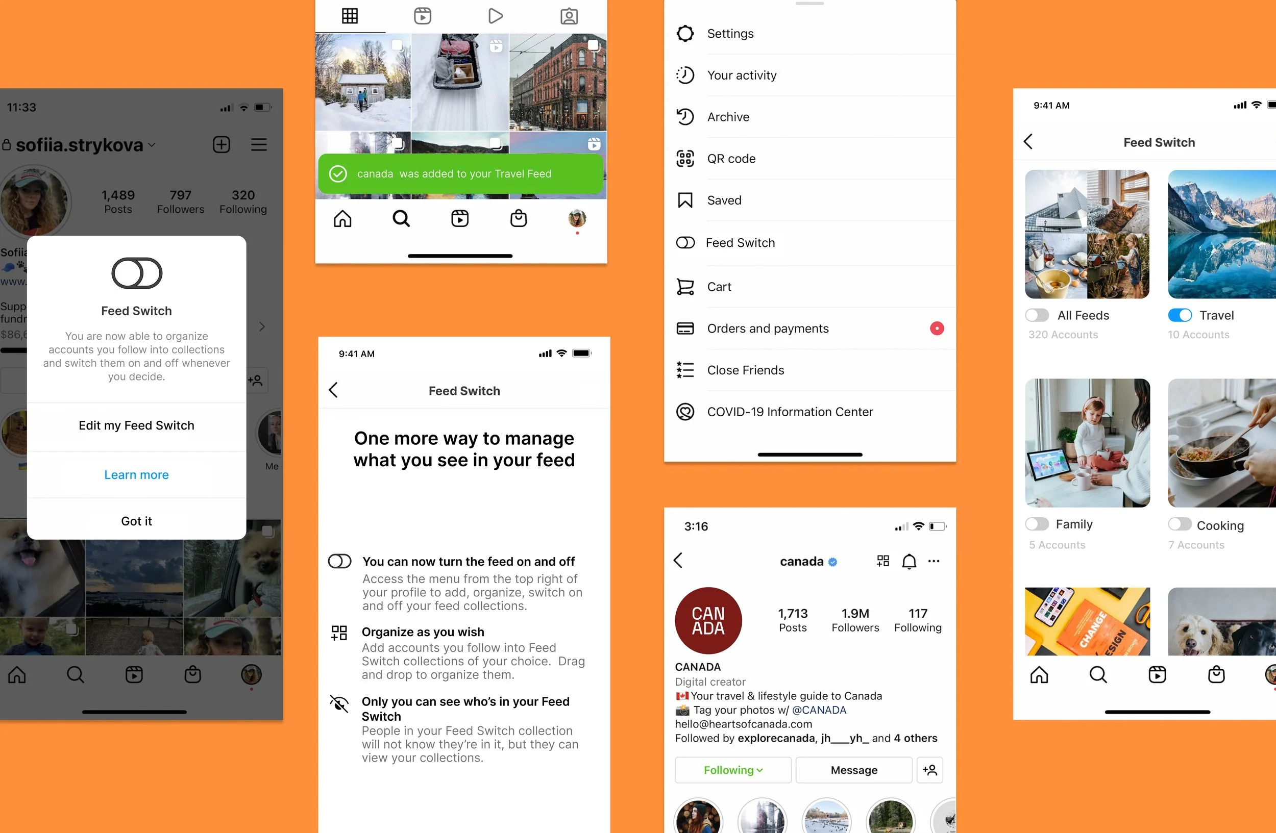
Key Screens and thought behind it.
Here are some of Key screens that would allow to seamlessly integrate the “Switch” feature into the Instagram App and let the user utilize it to the fullest potential in their daily life:
“Onboarding Pop Up” and “Learn More” screens would let the user know that there’s a new feature added to the app, without overwhelming them with too much. User may click “Got it” if they prefer to skip. Otherwise, user can read through 3 quick and easy bullet points: “you can now turn the feed on and off”; “organize as you wish”; “only you can see who’s in your feed switch”.
Currently, the existing flow of Instagram is that the user goes to the “Home” page where they access the “Menu” page with all the features. This is where I injected the “Feed switch” right under the “Saved” feature, because in a way this behavior is something user is well aware of (because “Saved” feature that also is relatively new to the Instagram flow, allows user to create folders and manage the posts they would like to access quickly whenever they want), so in that sense “Feed switch” is also a tool of convenience to help access information quickly and efficiently; this is the hierarchy I followed when looking for the right placement within the menu navigation.
Once inside the “Feed switch” feature, users can turn all feeds off/on, or turn only specific ones on/off (let’s say the “Travel” one for this kind of scenario), then user can also edit the feed and add/remove accounts into the chosen feed. They can search for accounts via the search bar, or conveniently click the icon top right (next to the notifications bell), to easily add the specific account into the Feed of their choice.
“How it works” screen can be beneficial for those scenarios when the user did not quite read about the new feature when it first landed, but wants to freshen up on the info regarding what it does and how to utilize it. In this case, the user may click on the light blue link top center and read through the info.
“Delete” screen carries a very important bit of information and clarification: that when the user chooses to delete the account from their specific news feed, it does not mean they unfollow that account automatically, it only means they will no longer see the news from this account within this chosen Feed.


05. Test
Testing solutions and iterating based on feedback.
I conducted Usability testing via Maze platform with 18 participants asking them to perform 4 main tasks pertaining to Switch feature. Based on results report, most successful screens were: Onboarding pop up screen, Home screen, Switch on/off screen:
“I think the design looks native and well-balanced”
“It is easy and intuitive”
“I would definitely use this feature”
“If such feature exists I would follow more accounts”
As for iterations, “Edit/Delete” Screen did not necessarily have the highest misclick rate, but some users pointed out it was confusing to see the “Delete” button placed above the “Edit” button. However, this is a pattern that Instagram app is following for other features as well, therefore changing it might go against native content hierarchy. The same goes for using a red tone for the “Delete” button, it might not be necessary to use this color but that is what Instagram platform implements as of now.


Takeaways
What have I learned?
🤓 Overall, the “Switch” feature received positive feedback and would be a great addition to Instagram App. It would allow users to save time, feel less overwhelmed, and be more in control of what content they are exposed to based on their personal needs.
🗂Going through the design process, my “Switch” feature went through multiple iterations. At large, I can say that all feedback was very valuable and every insight has helped me to shape my understanding of the problem and empathize with each user.
⚖️ One of the main things I learned from this project is that adding a feature to an existing app is the art of finding a balance between organic integration of the feature into the existing app ecosystem while effectively using research to back up and guide the user experience.
💁♀️ My next steps would be iterations based on feedback I received from the users, and then further testing to explore the effect of such feature on user behavior not just within the “Switch” but also pertaining to the perception of Instagram as a platform overall.